Version v0.27 of Metabase is no longer supported. Check out the docs for the current stable version, Metabase v0.63.
X-rays and comparisons are two powerful new features in Metabase that allow you to get deeper statistical reports about your segments, fields, and time series.
To view an x-ray report for a time series, open up a saved time series question (any kind of chart or table with a metric broken out by time), click on the Action Menu in the bottom-right of the screen, and select “X-ray this question:”
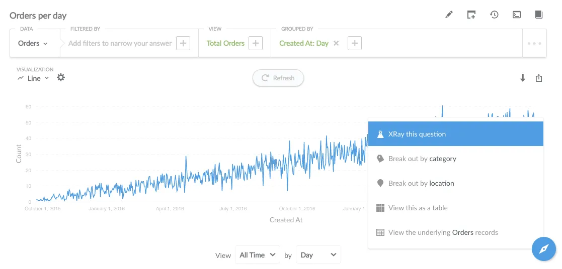
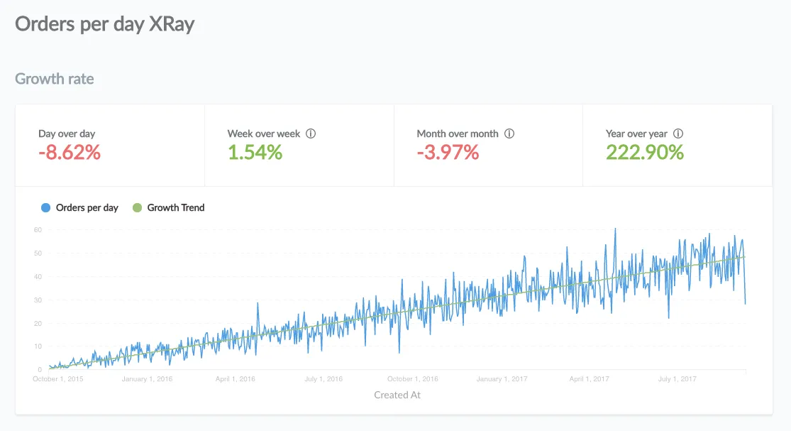
You’ll get an in-depth analysis of your time series question, including growth rates, the distribution of values, and seasonality:
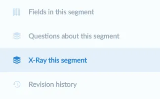
To view an x-ray for a segment, table, or field, first go to the Data Reference, then navigate to the thing you want to x-ray, then select the x-ray option in the lefthand menu:
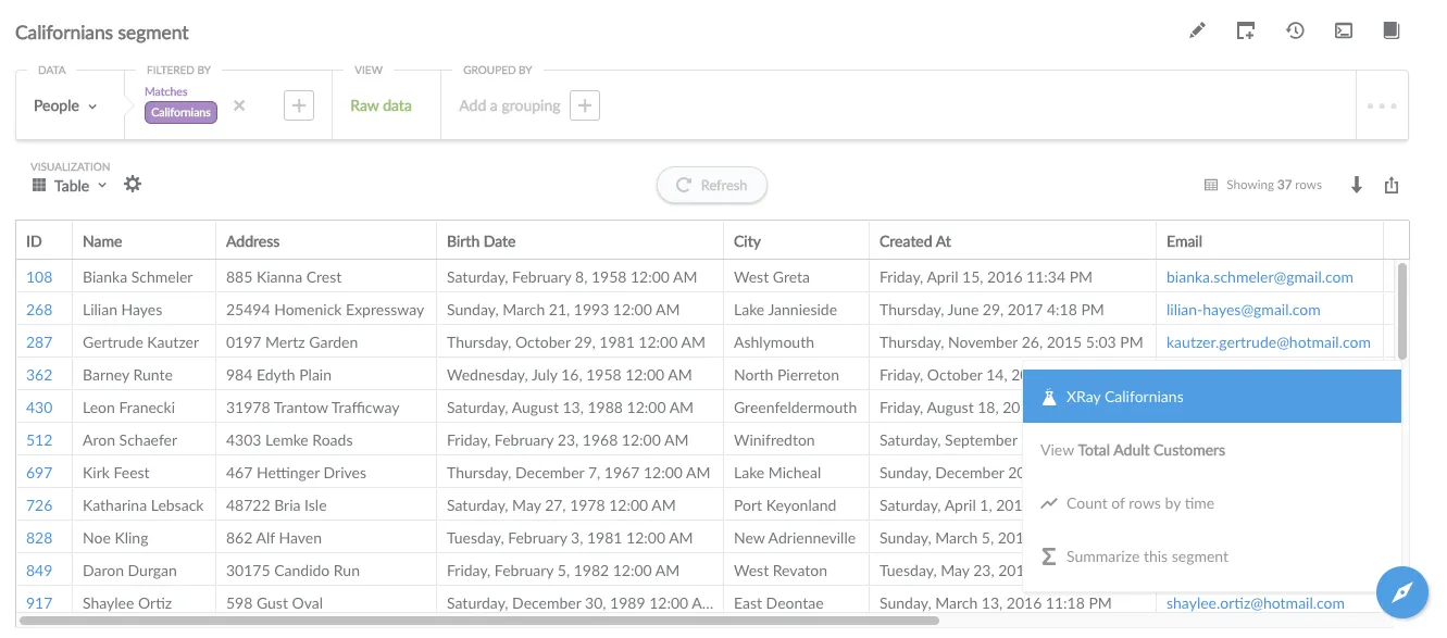
If you have a saved Raw Data question that uses one or more segments as filters, you can also x-ray one of those segments from the Action Menu in the bottom-right of the screen when viewing that question:
An x-ray report for a segment called “Californians” looks like this, displaying a summary of the distribution of values for each field in the segment, and the maximal and minimal values if applicable:
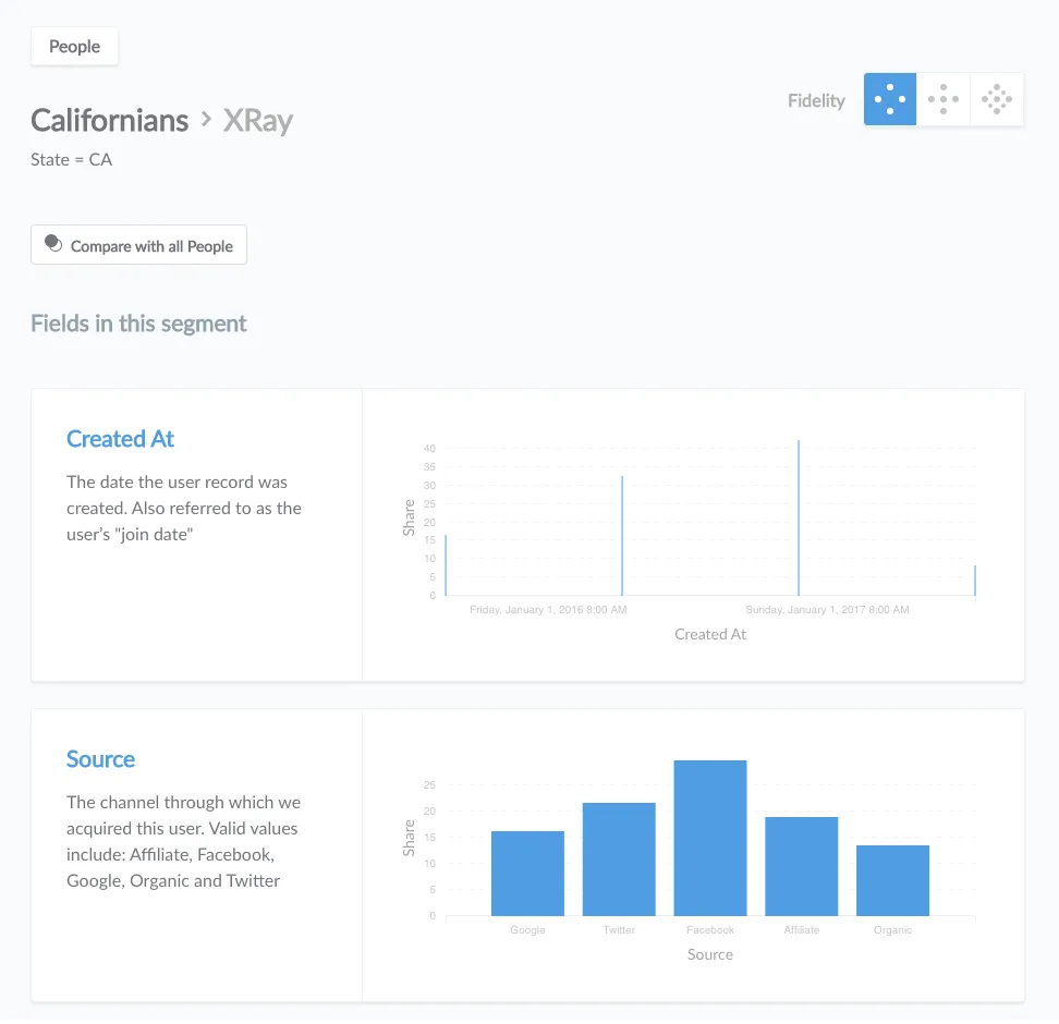
Clicking on the summary for any field will take you to the detailed x-ray report for that single field.
X-rays can be a somewhat costly or slow operation for your database to run, so by default Metabase only does a quick sampling of the segment or field you’re x-raying. You can increase the fidelity in the top-right of the x-ray page:

Administrators can also set the maximum allowed fidelity for x-rays in the Admin Panel. Note that the Extended setting is required for time series x-rays to work. Admins can even turn x-rays off entirely, but that makes Simon cry. No one likes it when Simon cries.
Segments are a subset of a larger table or list, so one thing you can do when viewing an x-ray of a segment is compare it to its “parent” table. For example, if I have a segment called “Californians,” which is a subset of the “People” table, I can click on the button that says “Compare to all People” to see a comparison report:
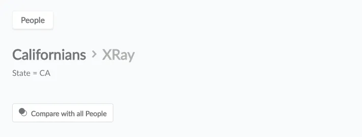
The comparison report shows how many rows there are in the segment versus the parent table, and also gives you a breakdown of how the fields in the segment differ from that of the parent table:
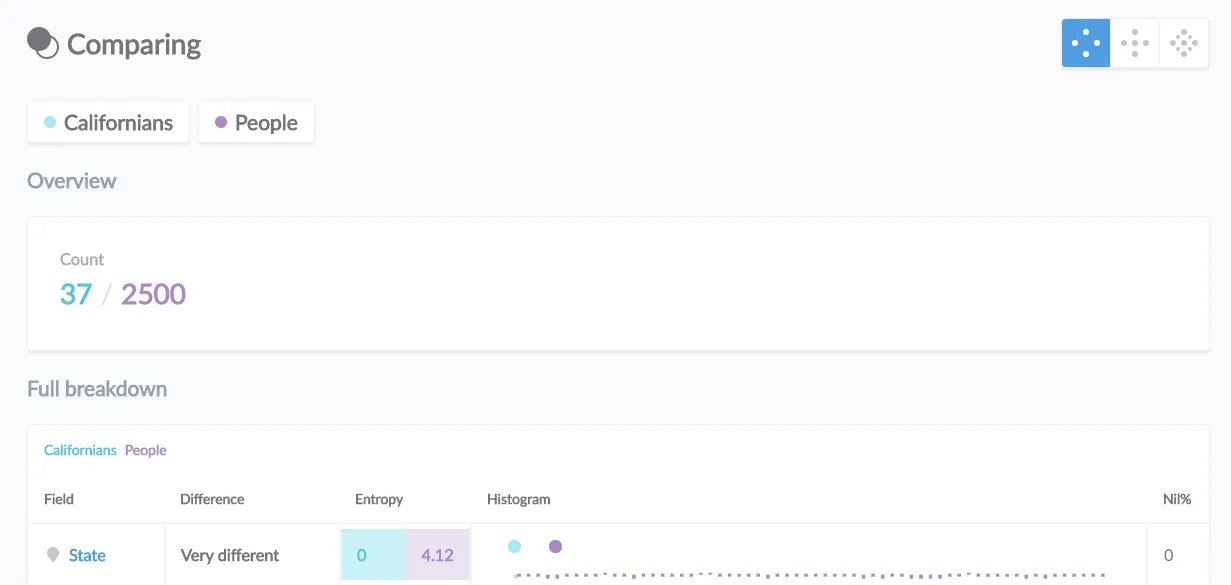
An example for where this can be especially useful is a scenario where you’ve defined many different segments for your users or customers, like “Repeat Customers,” “Users between 18 and 35,” or “Female customers in Kalamazoo who dislike cheese.” You can open up the x-ray for any of these segments, and then compare them to the larger Users or Customers table to see if there are any interesting patterns or differences.
Metabase hasn’t quite achieved self-awareness, but it has gotten smarter recently. It will now show you relevant insights about your data at the top of x-rays about time series or numeric fields, provided there’s something insightful to say.
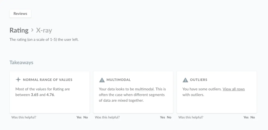
Insights include things like whether or not your data has an overall trend, has uncharacteristic spikes or dips, or if it follows a similar pattern at regular intervals.
If you still have questions about x-rays or comparisons, you can head over to our discussion forum. See you there!


